SaaS Product Design Best Practices: Steps, Trends, Challenges
Everything we see around us and everything we interact with is designed. This is what makes complex things convenient and understandable for us. And it's not just about the appearance of things, but also about the logic of their use and functionality.
With more abstract, digital things, we have the same. SaaS product design is about the software appearance, the user's journey through product features, the logic of using each button, and other essential things. So let's talk about this in more detail.
Importance of Great SaaS UI/UX Design
Great SaaS UI/UX design is an integral part of any successful startup. It affects users both consciously and subconsciously. Your audience remembers the product thanks to the first visual impressions. And what subconsciously influences the user's decision is the experience of usage: navigation, buttons, speed of processing requests, etc. As long as no detail is annoying, the design does its job well and makes your product visible to the target audience.

Learn more...
Get more details about the importance of design in our article Importance of Working Out UI/UX SaaS Design.
In this piece, we’ll talk about the main reasons to pay attention to this development stage.
Simplify User Journey
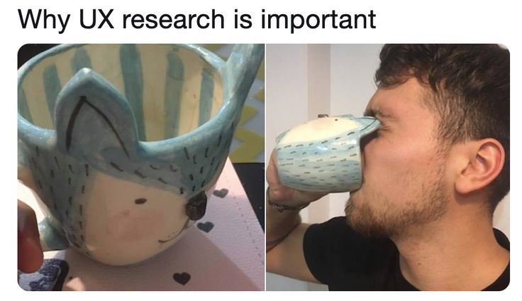
The first impression of your product is a huge part of its success. While opening an application or visiting a website, the user makes a decision to stay in a few first seconds.
A well-prepared SaaS design is not just your hook for attracting the users’ attention, and this is an opportunity to keep it for a long time. And this can be done if the user's journey is simple, clear, and comprehensive only.
UX designers create prototypes for a good reason. Every users’ journey test is crucial in SaaS development. This way, you can meet the needs of a wider audience and give people exactly what they are seeking for.
Reduce Cost of Development
Roger Pressman, an American software engineer and consultant, claims that fixing problems in the design stage costs ten times less than in the development phase and a hundred times less than after the release.
This is quite a subjective view, but still, it makes sense. It is much simpler to make changes and fix things in UI/UX design than do this during the development when it could require tons of code lines. Because the cost of a product always increases nonlinearly, it’s easier to save costs at the beginning of the development cycle, namely the design stage.

Learn more...
Learn more details of what the budget for computer software development consists of and how it can be reduced.
Improve Conversion Rate
In creating any product, it’s essential to put the audience and its needs first. And don’t forget that not all your customers have a high level of comfort with technology.
In this regard, UI/UX SaaS design is your key to understanding unpredictable user behavior and forecasting. It identifies areas of opportunity, implements convenient usage practices, and delivers to users what they expect. This is your way to improve the conversion rate and make the optimization process faster and easier.
Decrease Customer Churn Rates
It’s crucial for everyone who creates their first SaaS startup to understand that its success depends not only on the quality of business solutions and technical aspects of development. No matter how innovative and unique your product is, it will quickly go down without its value demonstrating and maintaining an influx of users.
Proper and, importantly, thoughtful design is your preventive measure against customer churn. The more comfortable your site or application, the better your chances of building a solid community of regular customers. And the better it adapts to changing user needs, the fewer people refuse to use it.
This is a partial list of things that make UI/UX design incredibly important for SaaS products. However, even from this checklist, it’s clear that it’s impossible to create a modern approach to development without proper design.
SaaS Product Design Issues
Every startup owner may face various challenges in the product development process. And these issues will be unique for software with different goals and purposes. However, there are some of the most common ones to pay special attention to.
Overwhelmed Interface
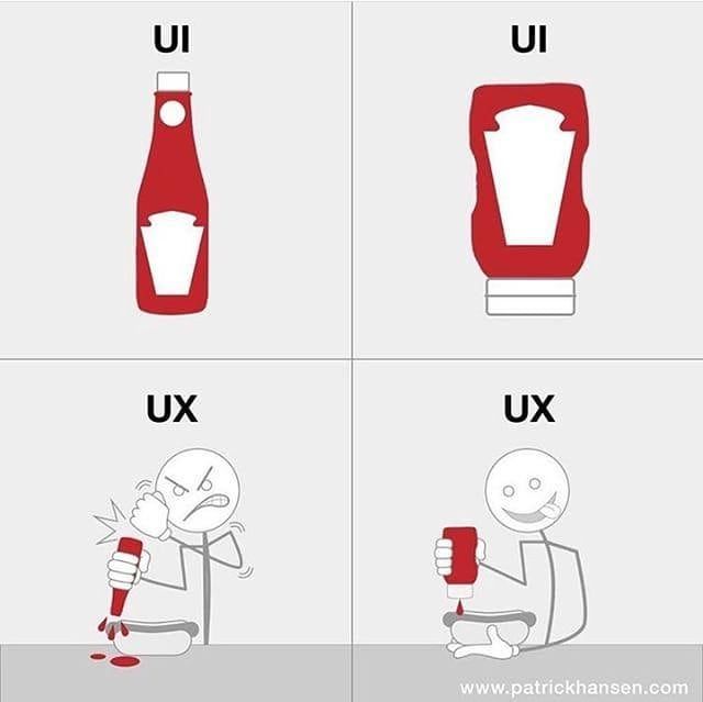
We all want our users to have access to all the features they need. However, placing everything on the home screen is not the best solution. An overwhelmed interface irritates the user and increases the outflow.
We shouldn’t overload our users with options. They either know exactly what they want or research the site to find something for themselves. That’s why the configuration should be changing on the fly and not remain a heavy chunk of unnecessary information.
So, the main question is how to provide access to the necessary information and not turn the interface into a kaleidoscope? The answer is simple: trust the client with freedom of orientation. To do this, you need to do a few things:
- Group features and information according to their priority.
- Create and test a user's journey map to determine behavioral decisions and patterns of user interactions with the product.
- Compose obtained data with general recommendations and best UI design practices.
Using proper SaaS app UI design, you can gently guide the user through the app without unnecessary details and wasting time.
Feature Assessment
Features translate your product’s value and benefits to your target audience. Its’ assessment is another challenge that the development team faces. The main goal is to ensure: no component worsens the user experience and blurs the clear picture of the interface.
In the early stages of SaaS user interface design, the team offers features, and UI/UX designers evaluate, group, and make them effortlessly available. Over time, one of the designer's tasks will be to choose which new features to add to enhance the product and improve the user experience and which ones to get rid of.
Designers also ensure that nothing complicates the interface, and all the changes bring value to users. Therefore, it’s essential to find a professional who can create easy navigation for features and assesses them correctly.
Correct Prototyping
One of the main issues in creating a SaaS product is the lack of functional prototyping and testing in the early stages of development. Without this, it’s impossible to assess the quality of future use and see the whole picture.
So, UX/UI design always works closely with users. The interactive prototype demonstrates how smooth and effortless the user's journey is, whether all functions work correctly and how good the user's interaction with the interface is. In this way, you can make the necessary changes based on testing without transferring the shortcomings to the app.
Steps to Design a SaaS
As far as each product is unique, the design of SaaS software from scratch can be slightly different. However, this process almost always consists of three main steps.Step 1. Pre-design
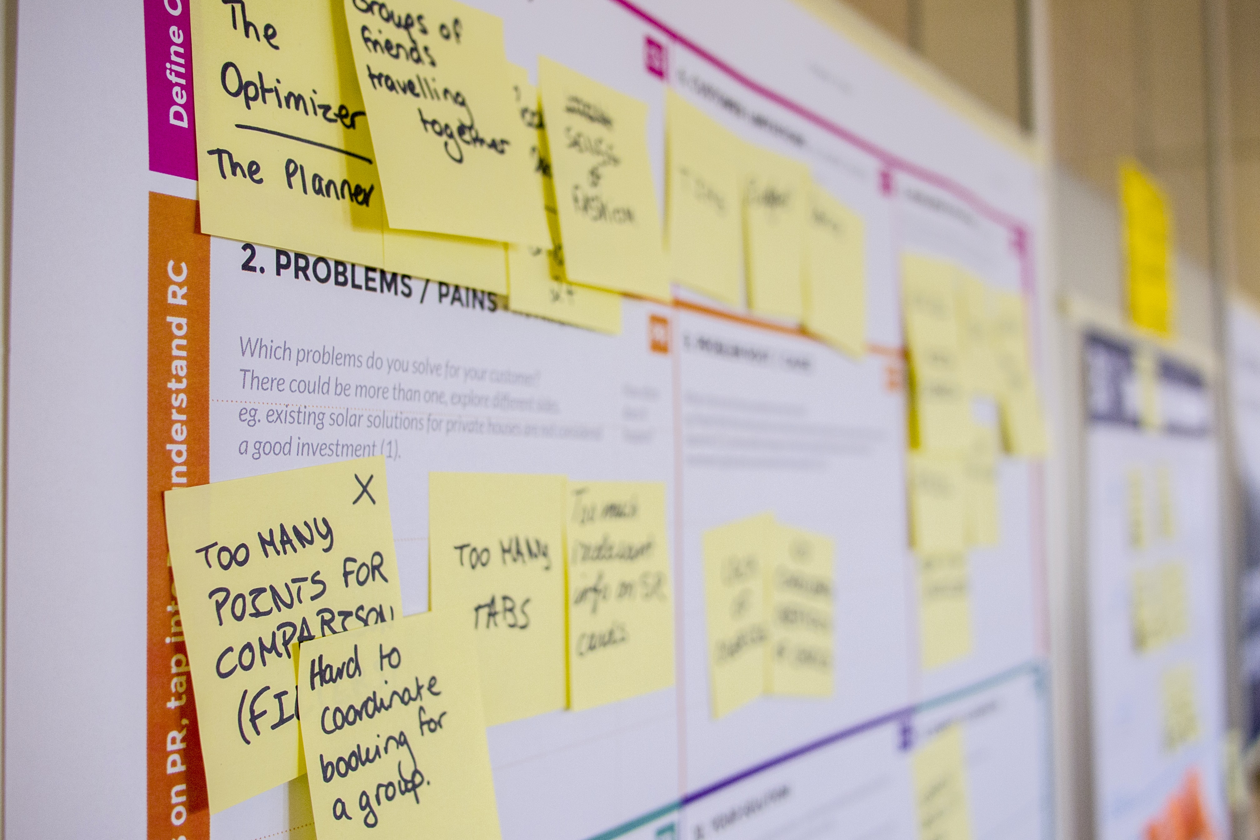
The pre-design stage includes data collection and analytics. Before you start UI/UX, you need to determine:
- application context (goals, customer needs, unique product features, essential features, etc.);
- users’ pain (anything that can irritate the user and make him give up using the product);
- users’ journey (all touchpoints, the scheme of user interaction with the product).
All quality SaaS products are user-oriented. Therefore, it’s crucial to identify the client. Who are your end-users? How will they use the product, and what are the “hooks” you can use to interest them? What device will they use?
During the pre-design stage, designers, business analysts, marketers collect data, analyze it, and build a design strategy. At this point, the team can create an MVP (minimum viable product) and use it for basic testing and future ideas/solutions validation.
Step 2. UX Design
User experience design is a product creation concept that includes interaction design, visual satisfaction, usability, and information architecture.
Simply put, this step is necessary because here, the team makes the product easy to use and enjoyable for interaction. This is where the previous analysis of user pains and needs is involved.
"If UX is the experience that a user has while interacting with your product, then UX Design is, by definition, the process by which we determine what that experience will be," Laura Klein said. So the primary goal of SaaS UX design is to create a product that will increase user loyalty through pleasant interaction and convenient usage.
At this stage, the team creates a kind of map that shows the relations between all software parts, the visual embodiment of the idea. A mind map is needed to keep the right connections in one place and not deviate from the concept.
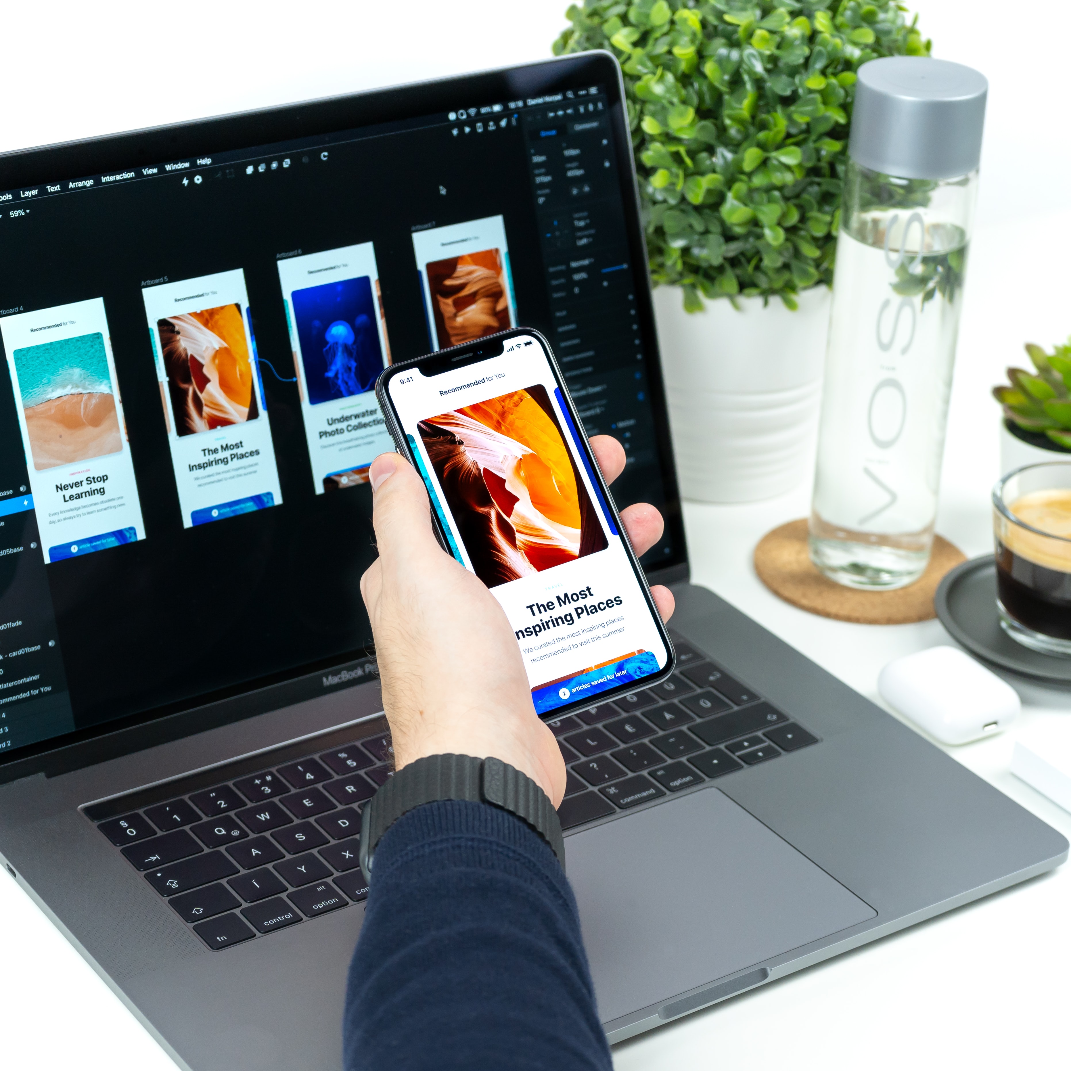
The UX design also involves creating prototypes with visual design and interactivity for further development and practical testing.
Step 3. UI Design
If the UX design covers the whole picture of the user experience, the SaaS UI design focuses on creating individual details/parts of it. This is the process of creating software interfaces, and the main focus of the designer in such cases is app appearance, style, simplicity, and ease of use.
Because users judge product design pretty quickly, the team is working on the following steps at this stage:
- Creating a way to perform tasks with minimal user effort. Designers build optimal solutions based on contexts and user flows using the client's journey map.
- Work with the interface enjoyability. At this stage, designers work on custom settings, gamification elements, animations, etc.
- Work with the functionality convenience: accessible and predictable buttons, visibility of all necessary icons and icons, clear hierarchy and readability.
- Choosing the appropriate interface design patterns.
The result of this stage should be a SaaS interface design that conveys brand values, evokes pleasant emotions, creates the correct associations, and is "invisible," i.e., completely convenient on a subconscious level. You can find more info about the whole SaaS development process in our previous article.
Have More Questions About SaaS Design Process?
Get a free consultation from our designers on how to properly build a design process in your company.
SaaS Design Best Practices
SaaS UX design best practices can vary depending on the tech trends. But in most cases, it’s a good rule to use the feature below in your product design.
Simple SaaS UI Design
Minimalism is a major trend in art, architecture and design for a reason. The world is moving towards minimal consumption, simple form and embodiment.
This trend is more relevant than ever for SaaS applications, which often have a wide range of functionality that should be provided to the user simply. The process of programming such products is already time-consuming, so the complex UI could really make things worse.
No customer will be satisfied with a confusing and complex design. Therefore, it’s good practice to think of a design that will cover all the product’s architectural nuances and stay convenient for users with different technology comfort levels.
Easy Sign-Up
The sign-up form is one of the product components that affect the user's first impression. Therefore, the simpler and more convenient this process is, the better the chances of gaining customer loyalty.
So, easy signing-up is:
- visible button on the main page;
- simple and short forms, collecting only the necessary data;
- possibility to register with third-party services (e-mail, Facebook, etc.).
A good practice is also a discreet but compelling call to action.
Implement Personalization
Correct personalization is a powerful tool for creating an incredible user experience. If you've ever dealt with streaming services or Google products, you've faced it really close.
All the users expect your product to offer them exactly what they are looking for. A few seconds of incorrect suggestions – your audience has left the site or application.
Personalization helps provide the necessary information as quickly as possible so that users decide to stay on the site or buy a product. It also plays a significant role in simplified interfaces by reducing the displayed elements based on the person's preferences. Its implementation also allows you to provide a relevant experience for very different user segments and reach a larger audience.
Hyperpersonalization
One of the current trends in SaaS product design is hyperpersonalization. Deep multichannel data (data from CMS systems, sales departments, analytics systems, marketing research, etc.) is used to increase customer engagement.
Hyperpersonalization allows you to go beyond simply understanding your audience and focus on the real needs of each client. It’s created after testing and collecting data from real users, so it requires a little more time and effort. However, implementing hyperpersonal solutions in the product interface can substantially boost product development.
Smooth Onboarding
Do not leave your customers to chance. Cool onboarding creates a solid emotional connection between your product and clients. If all is done correctly, this process will instantly get rid of pain points, eliminate the users' churn rate to zero and attract new audiences.
Unobtrusive step-by-step onboarding will encourage customers to spend more time learning about your product and buying your services. The personalization we talked about above is often involved in smooth, structured adaptation.
The fewer options and the easier the onboarding, the less effort the client spends to achieve the goals. The clearer the functionality, the faster the user realizes that the product will meet his specific needs. So, effortless onboarding is good design practice for SaaS product development.
Smart Search
Pointless browsing for the needed info is something incredibly annoying. Don't force your users to deal with it. A well-established smart search is a good practice in SaaS product design. All you need is effective filtering options that will lead the customer to relevant information in a few clicks.
Dynamic Sorting
Dynamic sorting is a must for intelligent search. It provides the ability to change the sorting direction in the report. This feature helps users receive only relevant information among the entire stock of data that matches a search query. Use it to make searching more convenient and helpful.
Examples of Best UI SaaS Application Design
Of course, we can talk about the cool Apple, and Google, etc. designs for hours. However, I would like to draw your attention to the non-obvious applications and sites that make our lives better and have marvelous UI/UX design.
OLIO
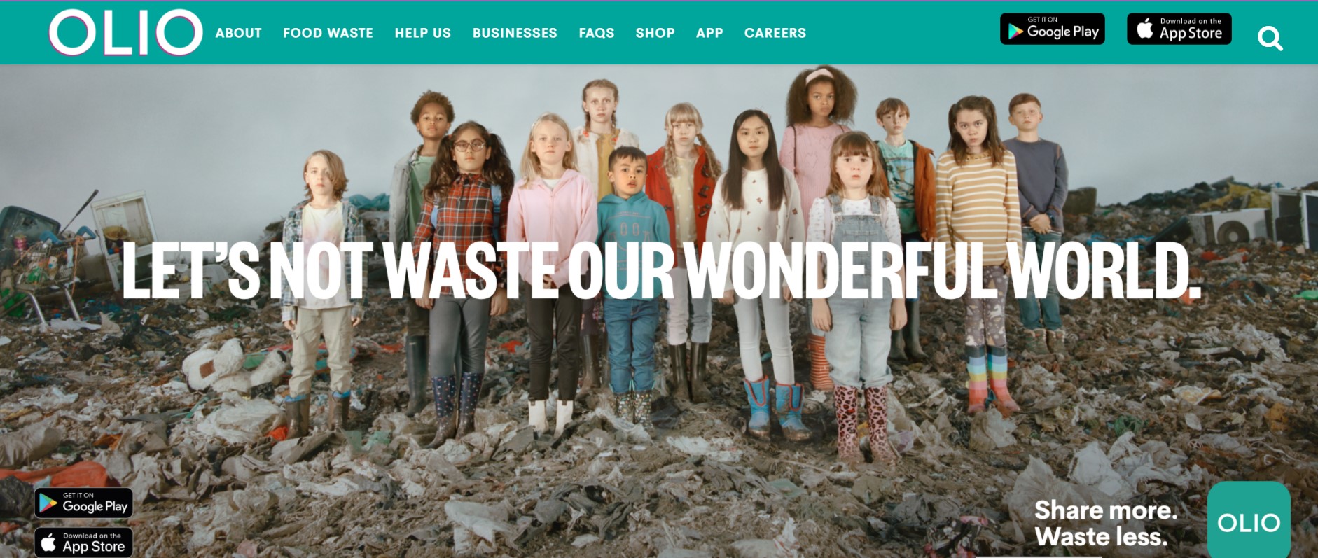
The first example is a great app called OLIO. It was created to connect neighbors and local shops to share surplus food and other things, not throw them away. This helps improve people's lives and solve such a fundamental problem as overwaste.OLIO has a very simple, minimalistic design, pure and valuable functionality, powerful search (which is located in the visible area), and convenient app versions for iOS and Android.
Mycoop
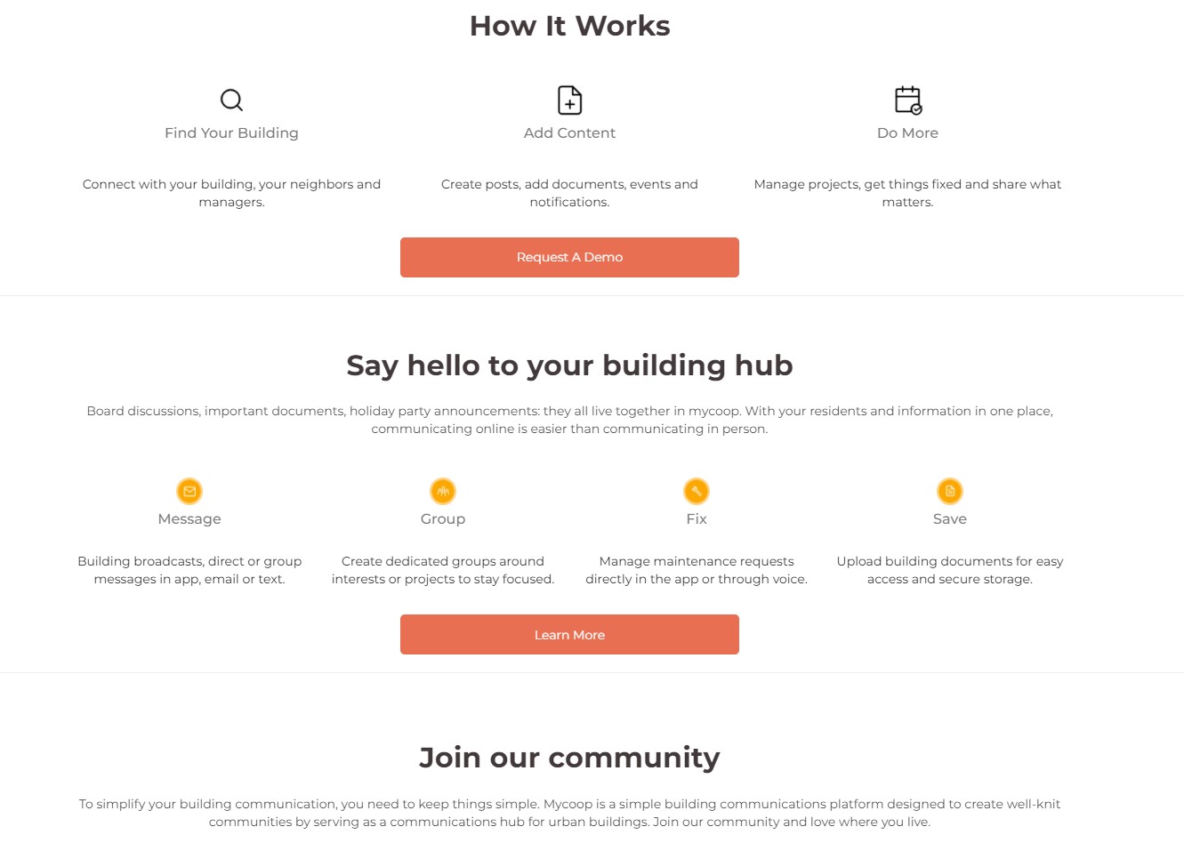
Mycoop is another great application for neighbors, which simplifies the process of housing management, communication between residents and creates a new environment to improve life in the neighborhood. This product has a cool cozy design and practical functionality.
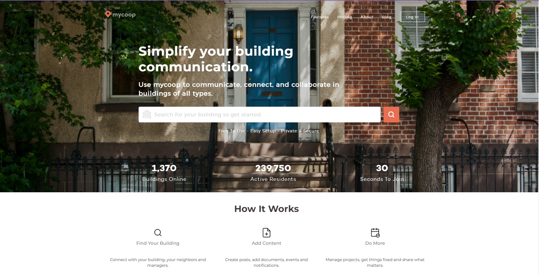
Also, pay attention to how onboarding is implemented.
Greenpeace
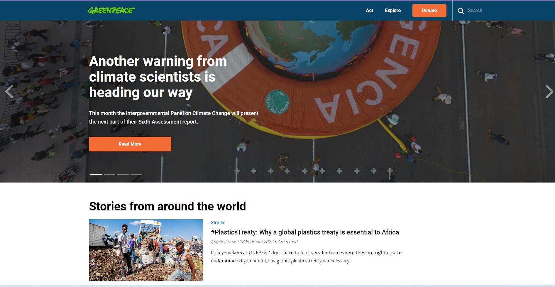
Greenpeace app and website is a perfect example of the UI/UX design that strongly motivates people for real action (just look at how the “Donate” button was highlighted and what imagery was used).
Of course, this is a more informational resource, so there are no futuristic features, only everything necessary. But the appearance is excellent thanks to strictly following the brandbook requirements and brutal fonts.
Journey
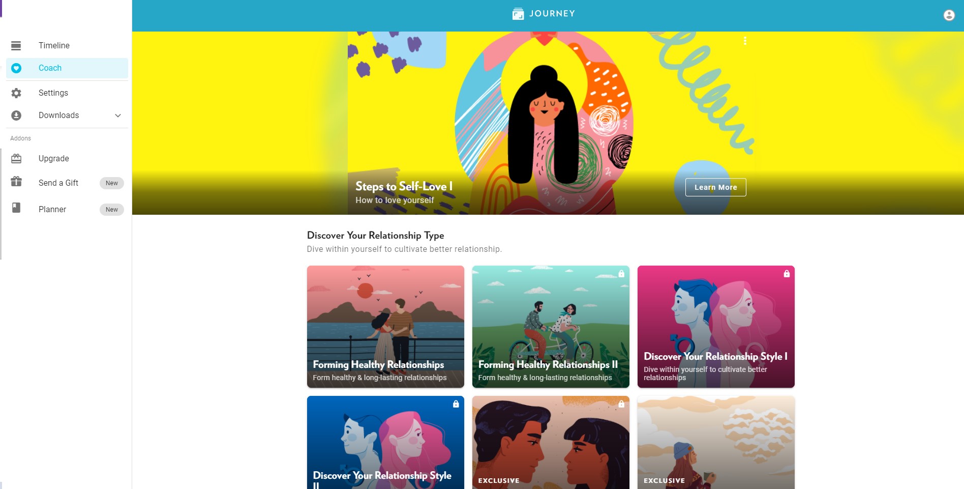
And the latest app that I think has a cool modern design is Journey. This application is created as an interactive diary that helps cope with anxiety, stress, insomnia and even depression.
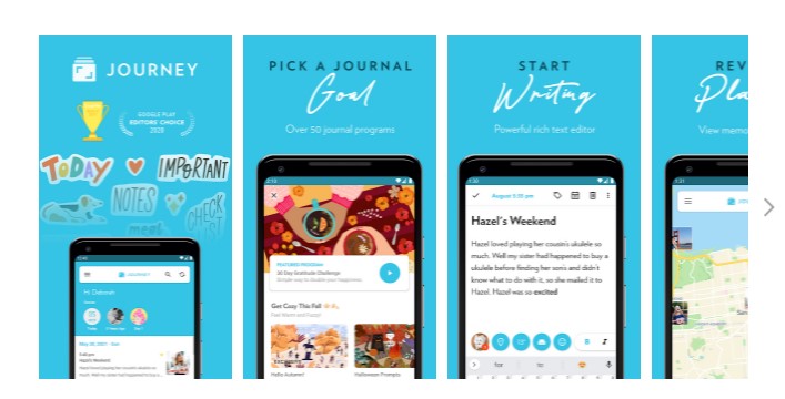
Such a living diary can be a motivational coach, which reminds of tasks in the form of a game, guides users in meditation, and gives helpful tips. It has versions for desktop, iOS and Andriod and synchronizes with the cloud via Google Drive (hello, device synchronization trend).
Cost of UI/UX Design for SaaS Application
The cost of UI/UX design for SaaS is influenced by three main factors: product complexity, team type, and location. For example, the cost of designing an application of medium complexity in the United States is from $45 000 to $80 000, and the services of same-level specialists, but in Eastern Europe, will cost you $15 000-$20 000.
You can find out more about the UI/UX design prices here.

Please note that every app has its own features and challenges, so the cost should be calculated after professional analysis and assessment. Contact our Senior Designers to get a personalised estimation of your project.
SaaS Design Trends in 2023
2023 is the year of democratization and fundamental transformation of the digital world. Some trends broadcast new values and help make the user experience comprehensive.
Data Visualization
You can share essential data with clients using visualization elements. It helps transform complex text or boring numbers into concise graphs, diagrams, etc. Data visualization can and should be interactive. This way, you add gamification elements and help the user get information quickly and with fun. It’s especially good for fintech apps where users have to deal with a huge amount of numbers and stats.
Immersive 3D Visuals
The immersive design allows users to interact with the product at different levels and gain an all-consuming experience. In most cases, virtual and augmented reality technologies, as well as mixed reality, are involved. It creates the feeling that the user is physically interacting with the product.
Immersive 3-D models are one of the main trends in product design. You can see them on architecture websites, gaming and medical applications, etc. Such elements do not just help to create a modern, user-friendly interface. It’s a great way to keep users' attention, and given the predictions about the Metaverse, a must to catch up.
Dark Mode
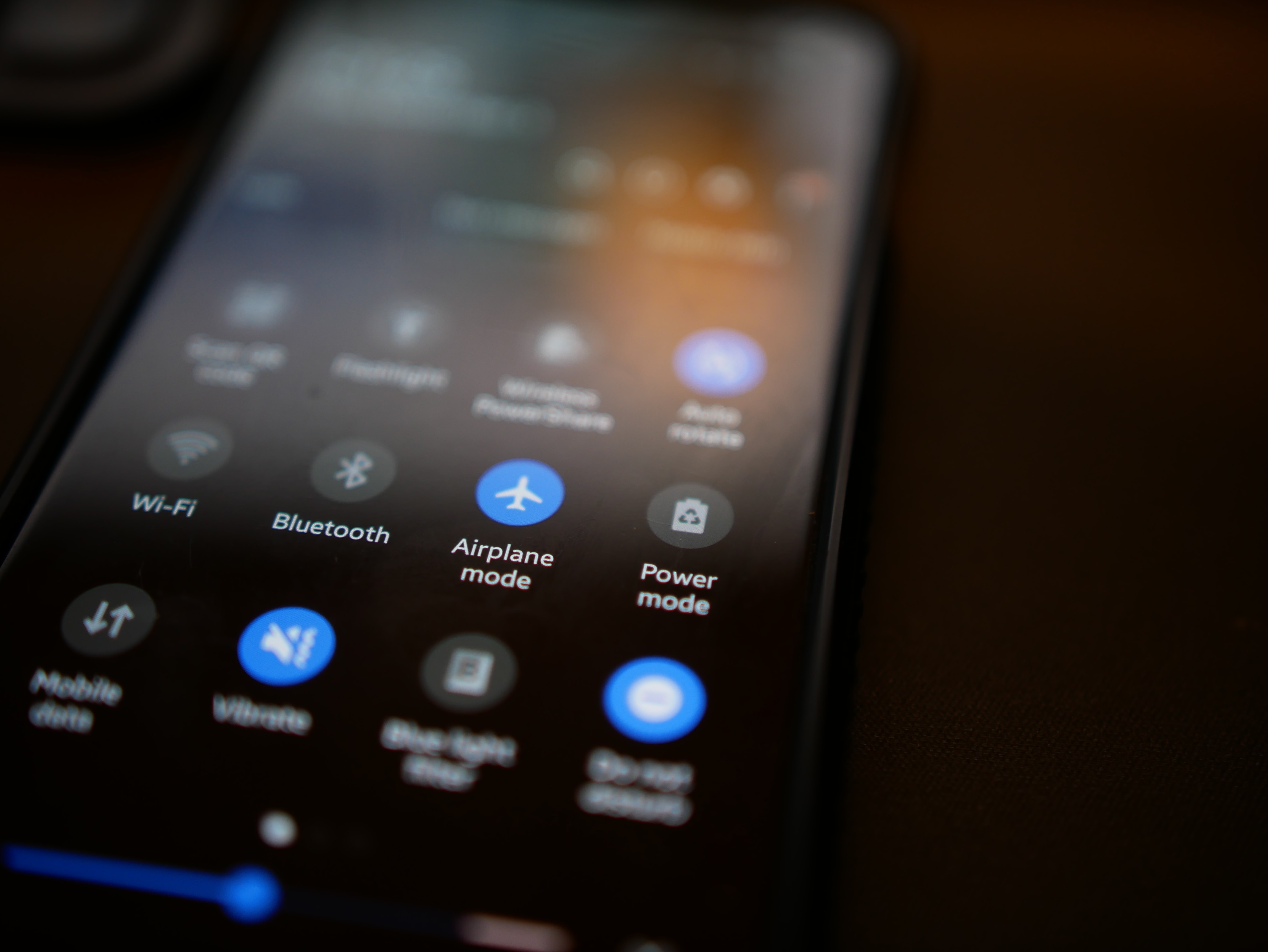
Statistics show that almost 82% of smartphone users prefer dark mode, nearly 83% use it with the OS, and about 65% expect dark mode to be automatic when browsing websites. In addition, the transition rate "to the dark side" among iOS users is 55-70%.
So, it is worth considering a SaaS UI design that includes a dark mode. This significantly reduces the user's eye strain, making the user experience much more pleasant.
Holy Cyberpunk: Holographic and Neon
When should we pay tribute to the aesthetics of cyberpunk, if not today? This trend has long been a source of inspiration for game designers and all those who create great products.
So, neon highlights, holographic elements, and the atmosphere of a noir cyber future could be a perfect solution to design SaaS software.
NFT’s and Democratization of Art
NFT, or non-fungible token, is a revolutionary phenomenon in the art world. This is a kind of digital representation of the product, which resembles a certificate of authenticity and is recorded on a blockchain. NFT can be the digital embodiment of just about anything, from Jack Dorsey's first tweet to an old meme.
And that's awesome. After all, it’s NFT that removes any intermediaries from the process of selling arts. It simultaneously grants ownership and distinguishes the original from millions of copies. This is the crazy democratization of the art world, as everyone can now find their audience and sell their work in an independent digital format. And anyone can discover art through the Internet and social media.
This trend is an absolute success, so it’s definitely worth using in the design of SaaS products. You can even turn the UI design into digital art – that's much NFT offers you.
Brutal Fonts
Digital brutality became a trend of SaaS website design in 2014 and still remains relevant. Cool, sharp and gritty fonts in the style of neo-brutalism have been added to the asymmetric layouts and non-stylized HTML. Feel free to use them for your product.
Elements of Microinteraction
Microinteractions, as the name implies, are quick and easy user interaction tools designed to make the user journey exciting and enjoyable. Such elements make up a whole system of interaction and guidelines, a kind of "microlanguage" that demonstrates to the client: we hear and understand you.
Microinteractions make the interface environment more human and welcoming. You often use them without even realizing it. These are likes and emojis on Instagram, stickers in messengers, etc. Such details show functions in a more accessible, fast and direct way. And this is an absolute SaaS UI/UX design trend in the coming years.

Device Synchronization
Device synchronization is a trend that is worth special attention. People use very different devices every day, and the number of digital “toys” is only increasing. So the need for a consistent user experience on all platforms is inevitable. You should think about developing software that can provide for it and give customers dynamic capabilities.
Simple examples of device synchronization are YouTube Premium and Netflix. If you stopped the video on your phone and opened the desktop version of the service, you can continue watching from the exact second. And it significantly improves the user experience. So think about how you can implement synchronization on different devices in the case of your application.
Ardas Experience in SaaS Design
We have extensive experience in custom UI/UX designs, including interfaces for B2C and B2B applications, mobile and tablet app design, data dashboards and visualization, etc. That’s why we provide three different types of cooperation: part-time designer, dedicated and project stage cooperation.
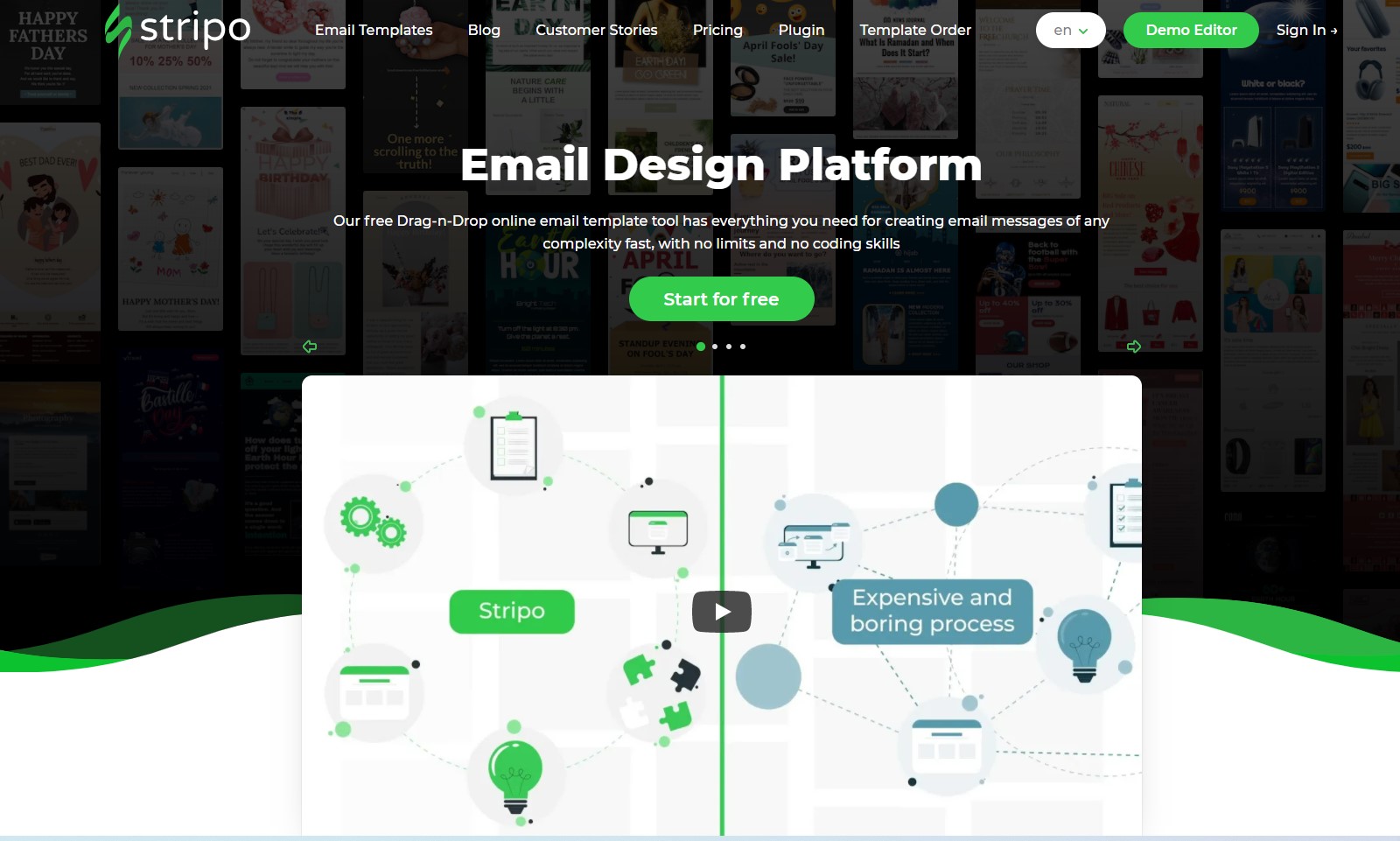
You can find in Ardas portfolio great designs for retail, commercial, healthcare, educational, and other apps, such as Stripo or CFD trading instrument. And we’ll be pleased to help you, as we know how to design a SaaS product from scratch.
Summary: Things to Avoid in Your SaaS Product Design
Everyone can find the best SaaS website design tips on the Internet, but, spoiler alert, it doesn’t really work. Professional product design includes some essential steps( analysis, assessment, user experience design, interface design, prototyping, etc.) that only experienced designers can deal with. So avoid creating product design by people who know nothing about it.
It’s a good practice to follow trends, but it’s not essential. In some cases, designers put app exceptional features and style first, and this is also a professional decision. Just don’t forget about such things as easy sign-up, smooth onboarding, personalization and smart search. Your app UI/UX should be engaging but plain and simple.
So if you have any questions, we at Ardas will be happy to help you. Just contact us in any way convenient for you.
