Apr 20, 2017
Greetings from the 90s
With the help of the Wayback Machine, you can see how some of the biggest brand’s websites looked like then and now. Their examples show that there are easy fixes using front end web development tools to update your site to meet this decade’s standards for quality design.
Jul 14, 2017
Development
When you picture a website from the ’90s, you probably think of black backgrounds, animated GIFs, clip art, slow load times and all around poor design. To be fair, in the ’90s we didn’t really know any better. Websites were new, and we were still working through some issues. Thankfully, today, we no longer crimp our hair, we ditched the overalls, and for the most part, we’ve moved on from outdated website front end design tools.
How can you be sure you’re using the latest design trends? We took a few lessons from major brands who have turned around their sites for the better.
Make sure your website background isn’t a distraction
In the ’90s, Pepsi used a black and bright green tiled background that felt like an optical illusion. Tiled backgrounds were once very popular, but today, we don’t recommend them. They’re hard to pull off successfully, and they tend to distract a visitor’s eye from the main content on your site.
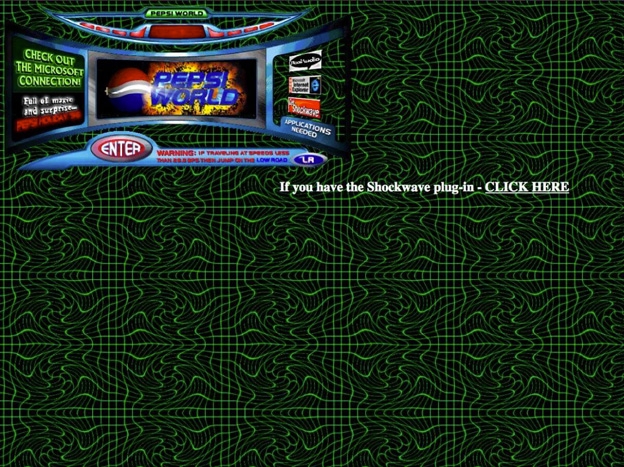
GIFs, cheesy patterns, and multiple colours were also popular backgrounds back in the day—and also not recommended for a modern-day site.
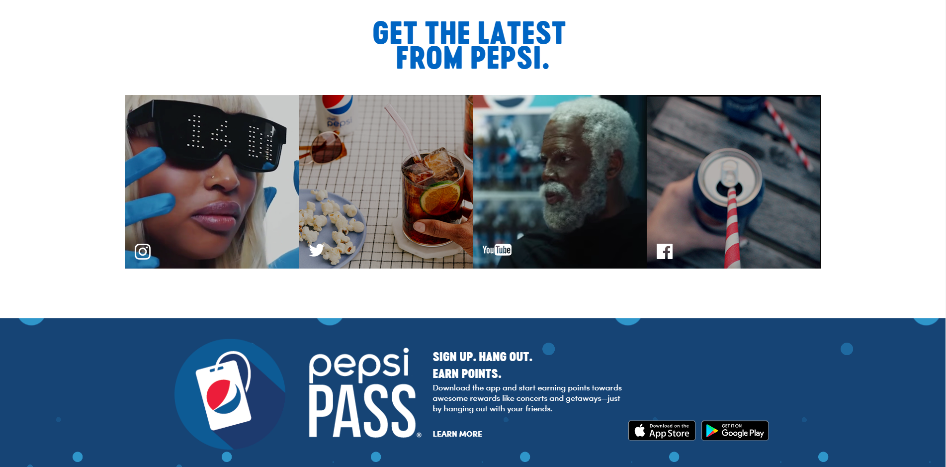
Pepsi’s website today is much easier to look at Today, Pepsi’s background is minimal. It uses a white colour that complements the company’s branding and doesn’t clash with the many videos, images, and text featured on the site. It’s a perfect example of how a simple background can positively affect the overall look-and-feel of your site.
Make your website fonts legible, rather than fancy
We hope most people had 20/20 vision in the ’90s, because reading text on these websites was quite a challenge. Many used gradient colours on text, and bright colors on dark backgrounds, like in this early version of Ardas website. While front end coding, decorative fonts, like cursive, were also common. In an effort to craft unique designs, ’90s sites often made their text completely illegible.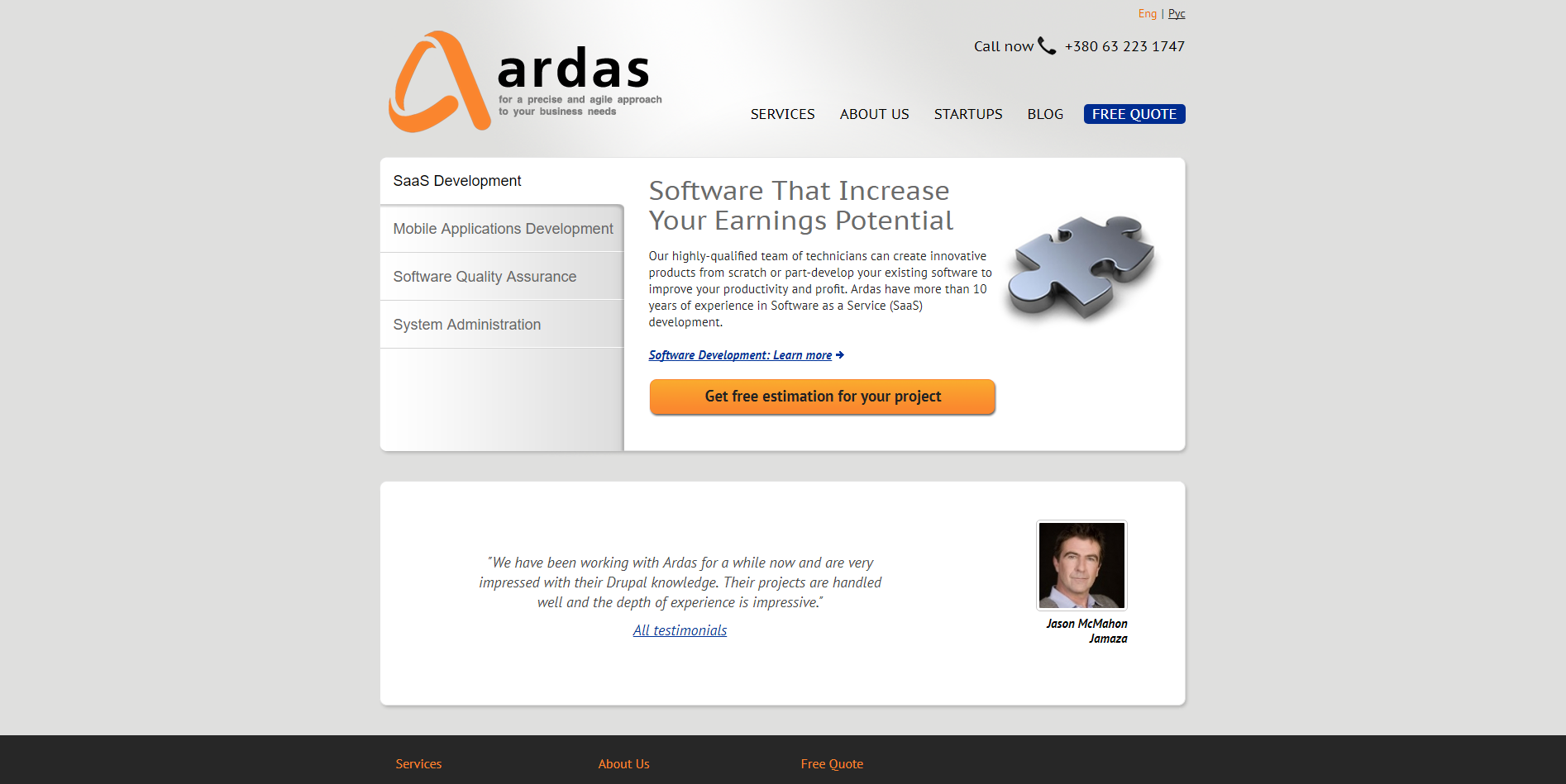
Today we have improved our site by simplifying it. We have chosen a simple colour scheme of grey and orange, and we are using a consistent, easy-to-read font throughout.
To make sure your site doesn’t have legibility problems, choose one to two fonts to use on your entire website. The most important factors for choosing the right font are size, color, and contrast. Typically, sans serif fonts (fonts without a line at the end of each stroke) tend to be easier to read than serif fonts. And skip the red text on black backgrounds.You don’t have to stick to old school fonts like Arial and Times New Roman, either. There are many new web fonts that are legible and a bit more modern. If you want to stay on the safe side you can refer to some of the most popular fonts used on the web today. Roboto is one of our favorites!
Pick website colors that are easy on the eyes
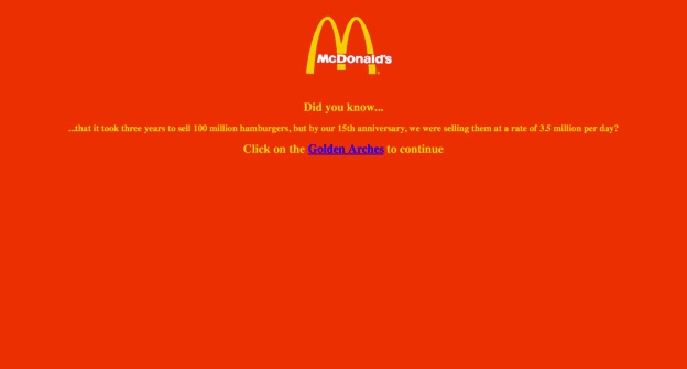
Neon green, purple, yellow…in the ’90s, we all loved color, and lots of it. Companies often used their brand colors throughout their sites, but, depending on the colors, this was a bit problematic. The ’90s taught us that just because a brand’s colors look good on a menu or a storefront sign doesn’t mean they will look good all over a website.For instance, look at McDonald’s old website. The company’s red and yellow colors that we know and love on their restaurant looks terrible on a computer screen. (See rule #2, keeping your fonts legible!)
Today, their site uses a calming dark grey and they incorporate their brand’s colours in a subtle way with a top menu.
 Color can have a big impact on whether or not visitors enjoy your site. Great web designers put a lot of thought into choosing colours that will resonate with visitors. The psychology of colour in front end programming web design can impact the success of your site.
Don’t bore visitors with too much text
A well-designed website has a balance of text and visuals. Apple’s homepage in the ’90s was all text, text, text. At the time, there was a reason for this: slow internet speeds. That may have been the norm back then, but today, a website with too much text will scare away many visitors who are looking to get information quickly, without a lot of reading.
Today, Apple has replaced its copy with visual representations of its products that communicate much more than text alone. This makes it more inviting and easier for visitors to find what they’re looking for.
Not every company has a product to sell or images to use on their site, in which case you can visit sites like Pixabay, Fotofolia, and Unsplash to get high quality photos. if you do have an online store, you can learn how to take professional product photos on your own.Or if icons are what you are looking for, we recommend FlatIcon and iconmonstr.
Incorporate large, bold images
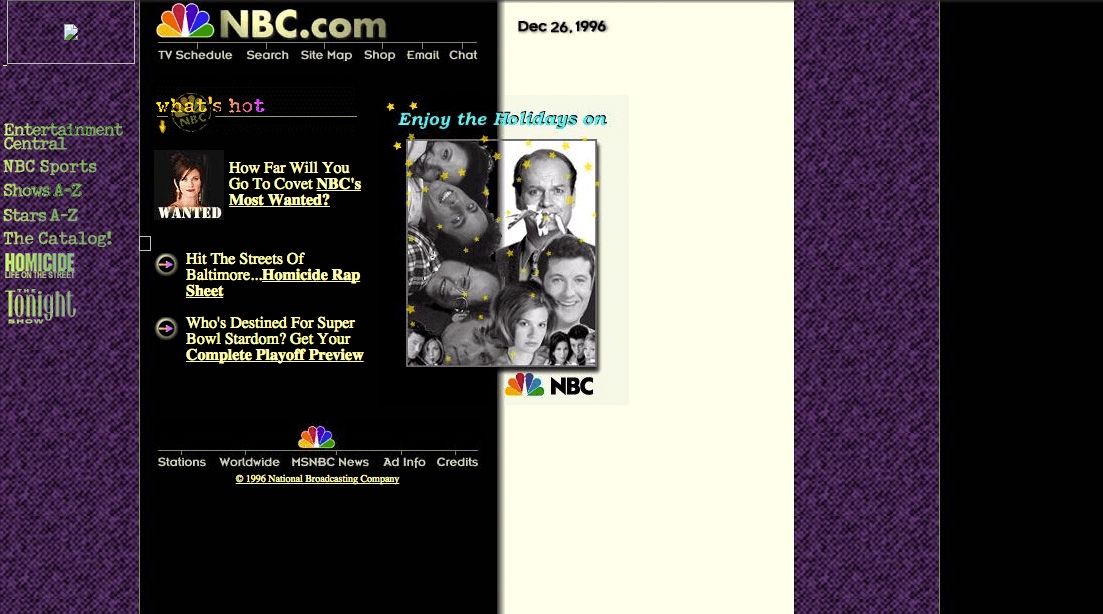
On a related note, when you do use images, go big! In the ’90s, NBC committed many web design faux pas. Their background is too busy and the font color is a hard-to-read gradient. But their biggest mistake was the use of small images. See that tiny woman in the top left corner? Does she look familiar? If you can’t tell, it’s Courtney Cox from Friends.
The difference between NBC’s website in the ’90s versus today is night and day. Today, NBC’s site is sleek and professional. The large photos have a high impact and draw you in. And best of all, you don’t have to squint to see.
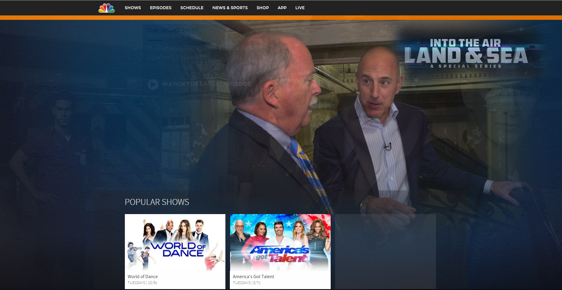
Today, images override text when it comes to good design. A popular web design tip is to use a hero image. What’s a hero image? It’s a large banner image placed front-and-centre on your site, like on NBC’s site today. Remember, if you’re going to successfully add images to your site, be sure to use the right file format and size. A blurry or broken image is so ’90s.
Simplify your homepage to keep visitors engaged
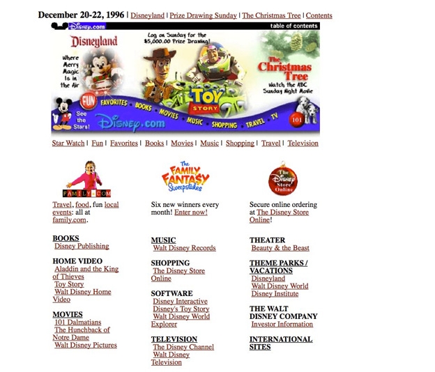
Disney has always been a leader in innovation, and for the ’90s, their website was not half bad. But their site made one key mistake: it had a poorly structured homepage. With two different navigation bars, a busy feature image, and a long list of links in multiple columns, there isn’t much hierarchy or prioritization in this old site. Everything is thrown at the visitor all at once, and it’s hard to know what to look at first and where to go next.
Today, visitors want to be shown the main components to your site and find what they’re looking for quickly. The homepage is the compass to the rest of your site, so keep it as simple as north, south, east, and west! Think about what pages or information a visitor would want to see first, and make sure that those are prioritized on your homepage.
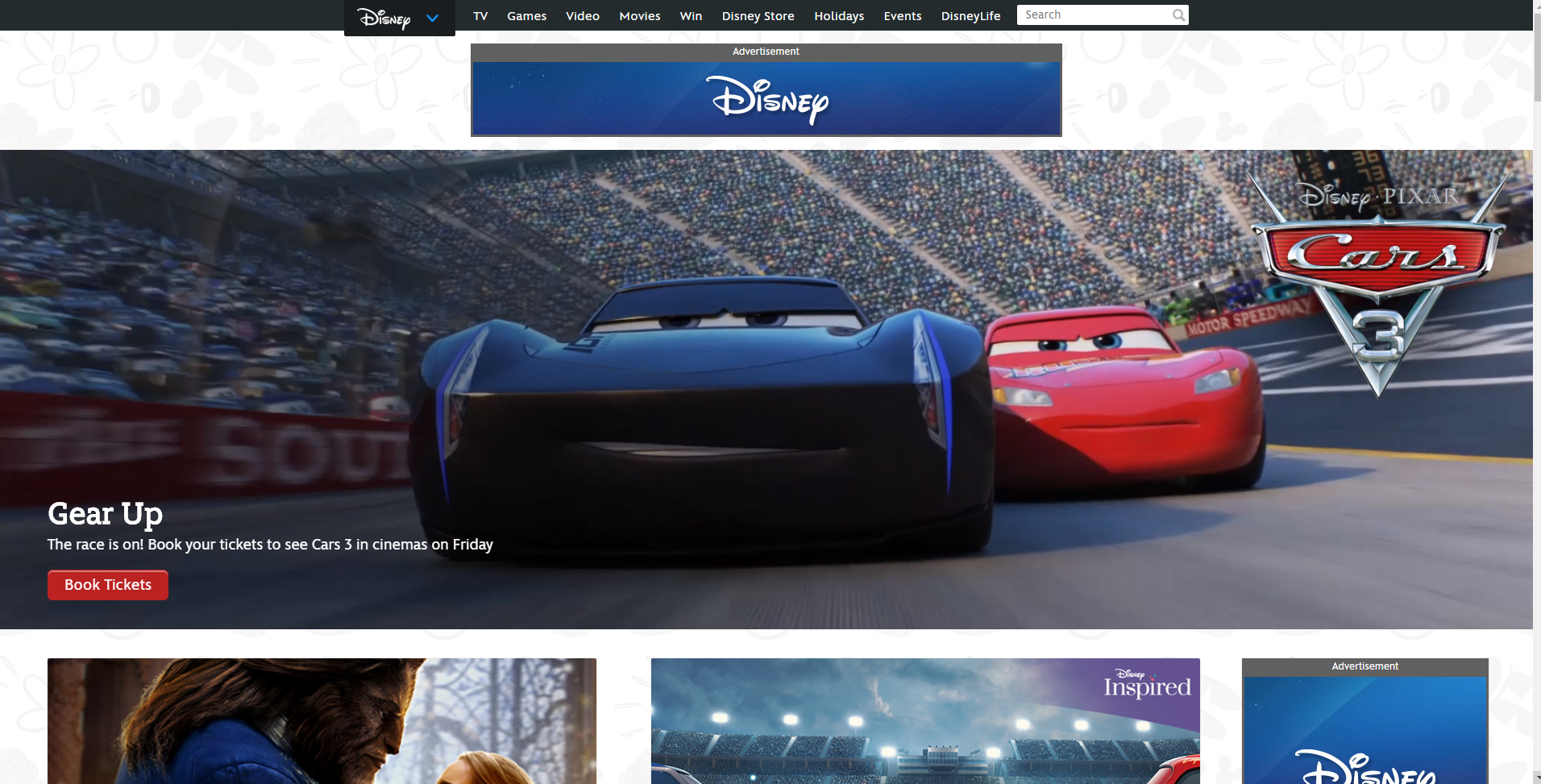
While it can be tempting to throw as much information as you can onto your website, I recommend keeping your homepage’s design minimal in order to keep visitors on your site longer and avoid high bounce rates.
Best regards,
Your Ardas Team
Table of content
See also
Mar 29, 2017
Why Does Your Clinic Need a Mobile Application?
Jan 13, 2017