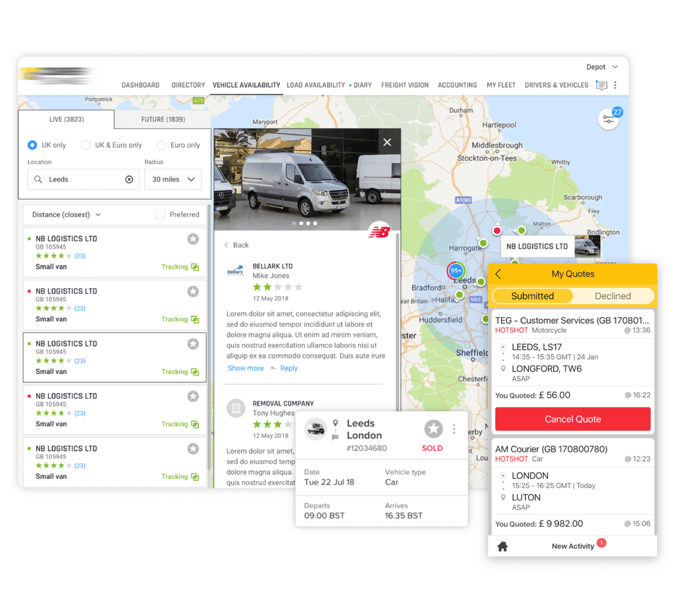
We provide a user-experience design
No matter how complex your project is and despite the development stage, our designers are ready to get involved at any time.
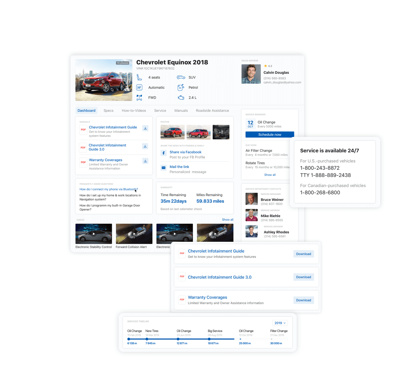
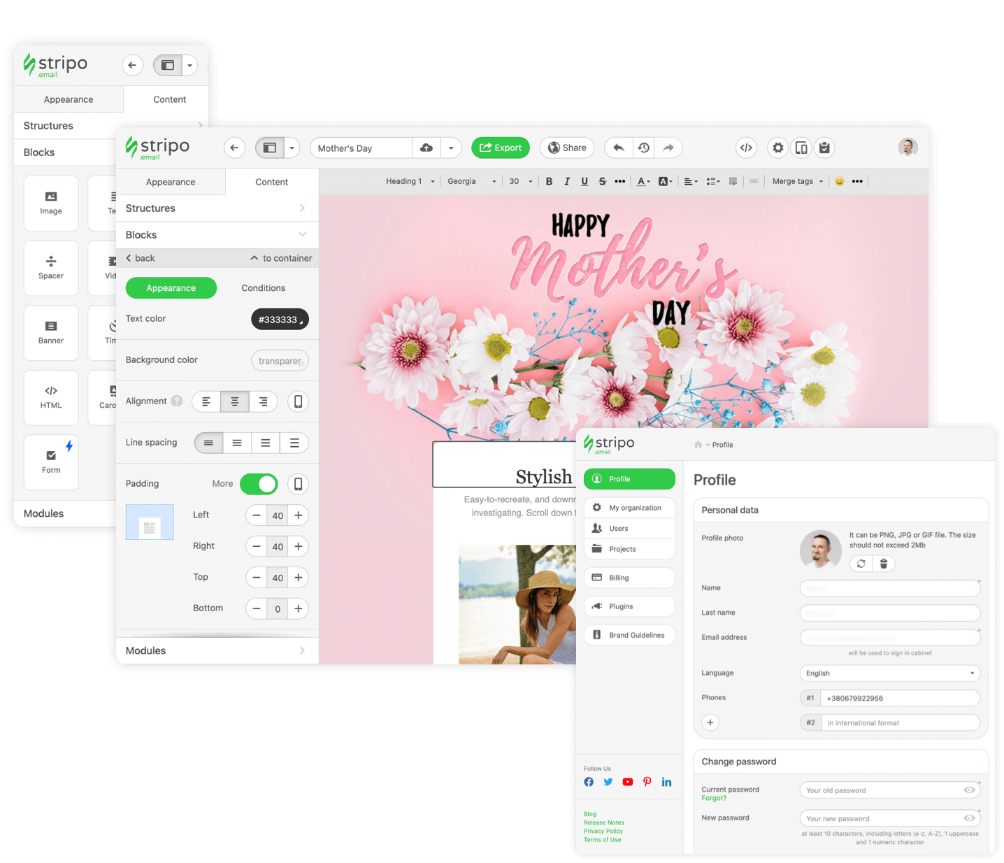
Custom frontend UX design
We will design interfaces for B2C and B2B applications that make your project more competitive to work with the product, convenient and fast, and easily involve users.
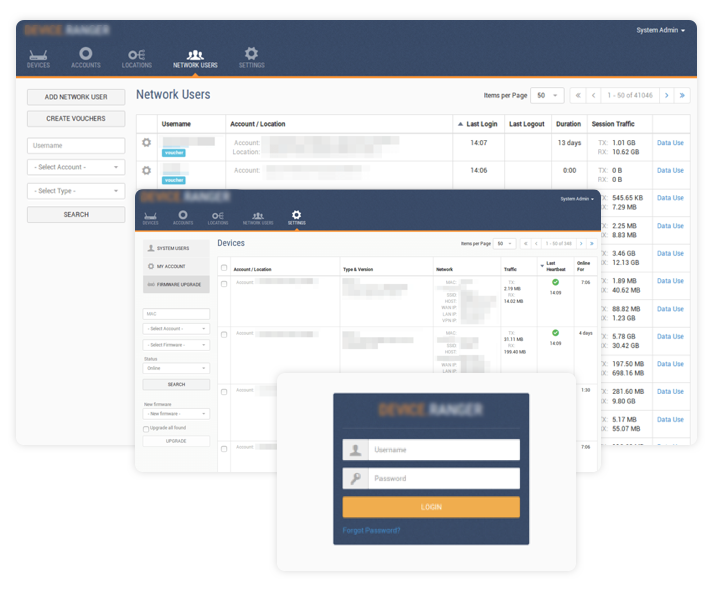
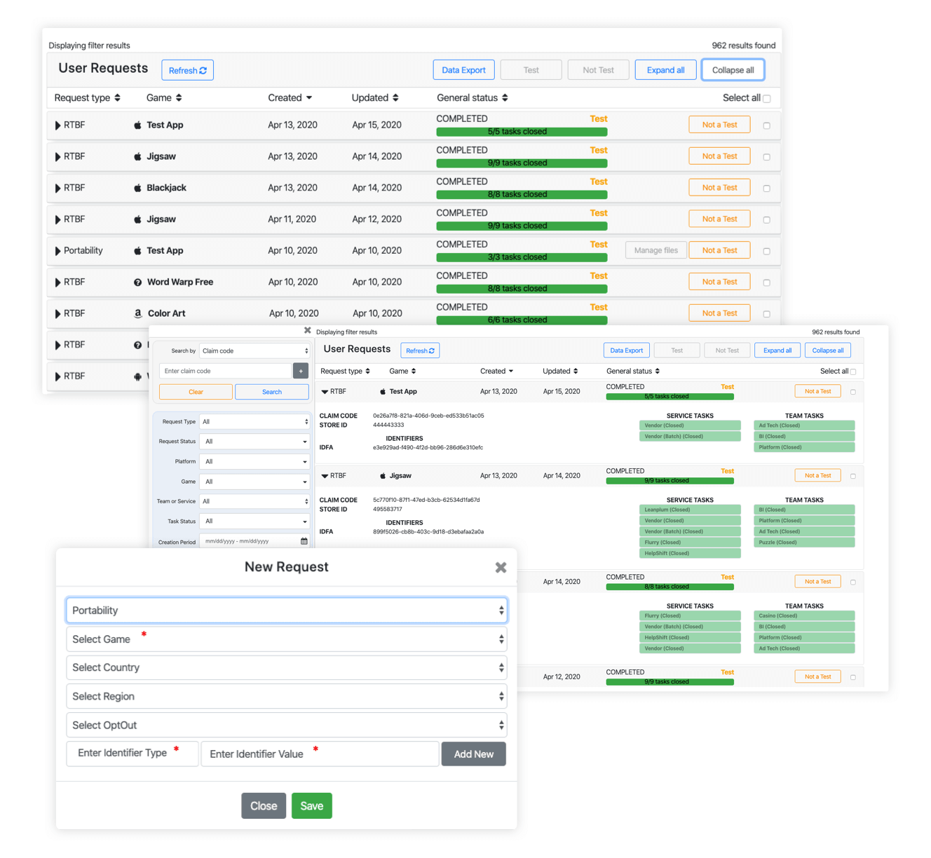
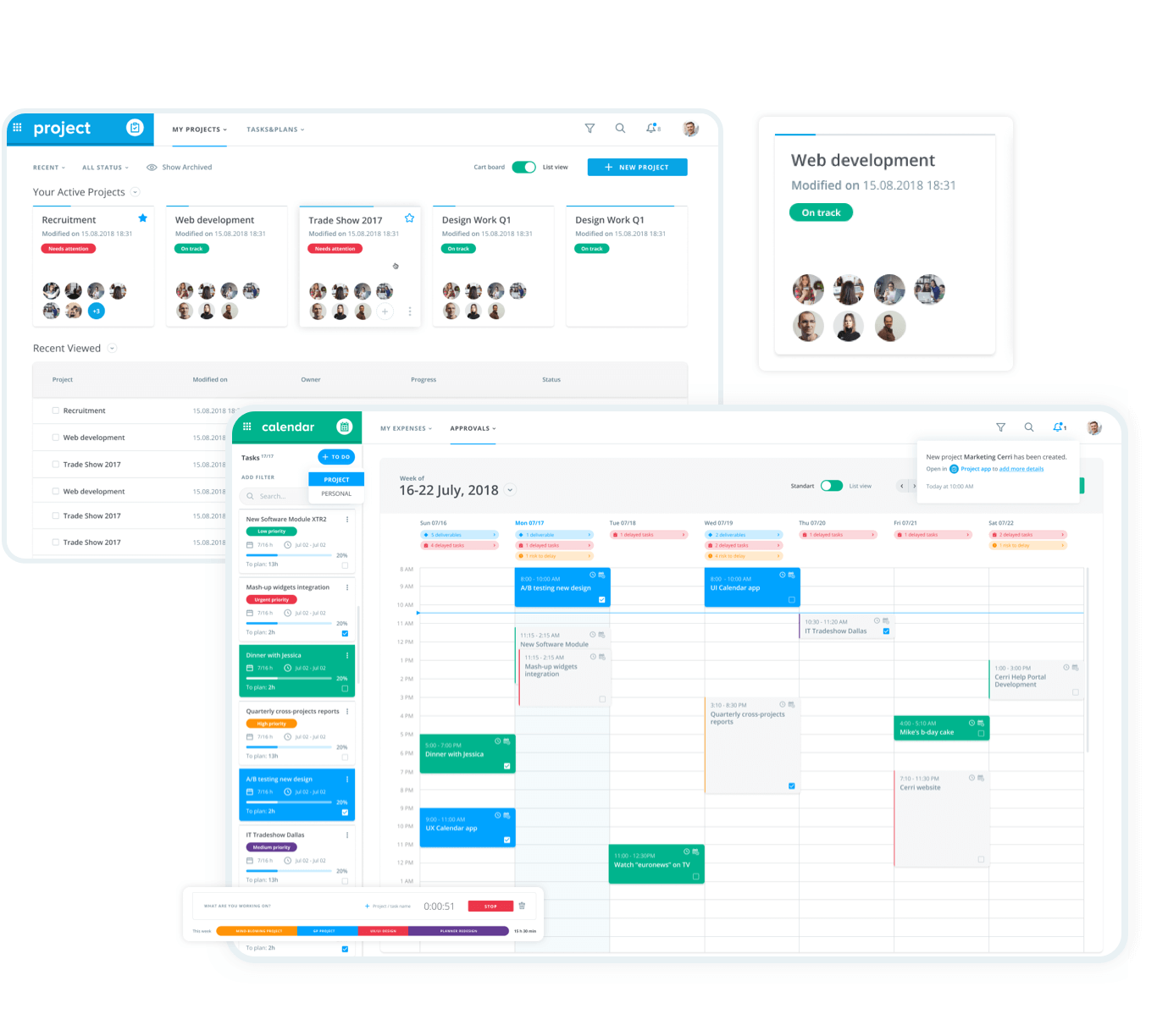
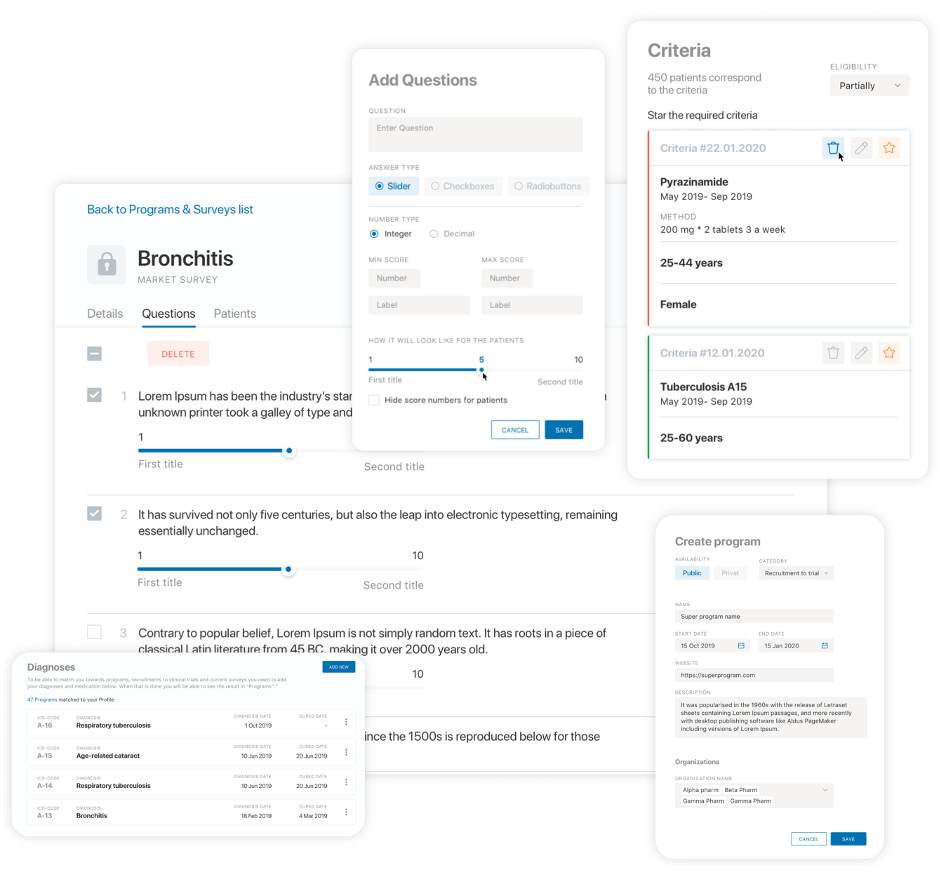
Administration UI design
We develop web interfaces for managing data, users, finances, business processes, devices, etc., which save administrators time and provide control and management.
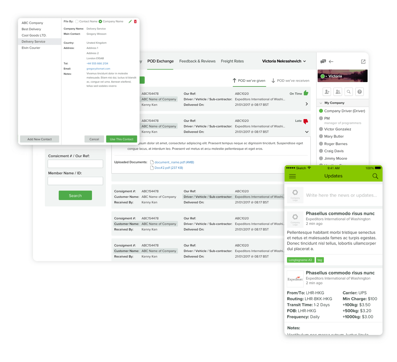
Mobile application design
We develop the design of mobile applications that complement the software products, giving its users the ability to access from any mobile device efficiently.
Tablet application design
We provide UI UX design services aimed at specialized tablet applications for B2B products optimized for medicine, logistics, construction, kiosk applications, etc.
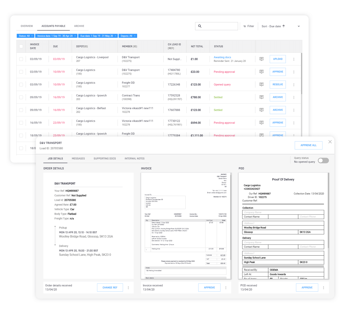
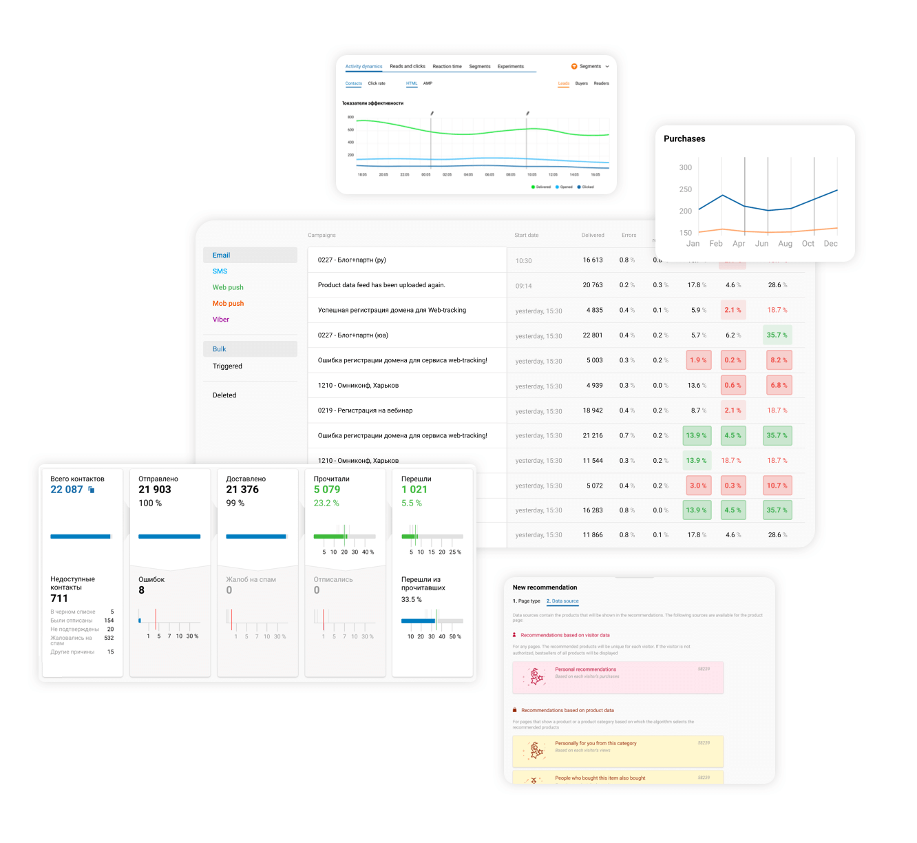
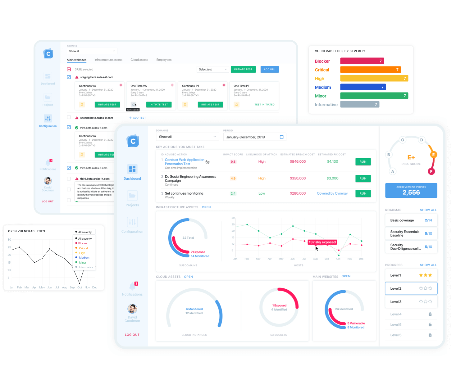
Data dashboard design
We develop data visualization that gives a lot of info to analysts, allows them to receive the info, and makes adequate decisions. We will also design custom dashboards for monitoring software business.
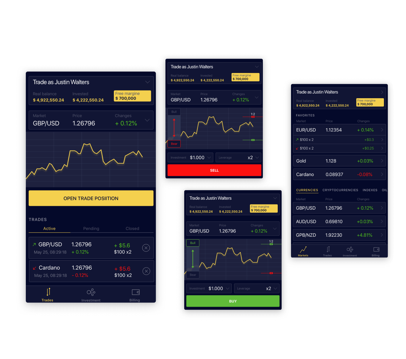
Promotion website design
We work only with custom designs, where it is necessary to implement business and marketing requirements, and never work with template solutions to promote online business.
UX design cooperation opportunities
We have developed three types of cooperation that will cover your design needs as much as possible and will stop you from spending extra money.
Part-time designer
No matter how large the product is, a full-time dedicated designer is almost never required. So instead of hiring a staff, it is better to work with us - you will get a senior designer with extensive experience at a very reasonable price because you will only pay for hours actually worked.
Dedicated designer
If you have so much work that you need a full-time dedicated designer, then here you can hire a UI / UX expert to work monthly only on your project. The designer will not be distracted by other work and will be 100% assigned to your product. So you can reach him anytime and get the full project update.
Fixed cost project
Sometimes, you need design cooperation just at a certain stage. Such as small projects for MVP creation, presentations, concept visualization, and prototype design can be done at a fixed price. Design is always preceded by a research and discovery phase.
Our most successful front-end UI/UX design cases
Here are a couple of projects, product designs, and UIUX designs we did from top to bottom. Those are our masterpieces because they met the client's expectations during the first review and received high marks from the customers.
Design stages
Step by step we will help you achieve a perfect design that is easy to the user and intuitively suggest how to use your software product.
Request study
Analysis and detailing of features offered by the client
Competitor analysis
Identifying the moments where your product can be better
User research
Defining of the behavioral tangs of users and their work patterns
Creating layouts
Only wireframes to display the functionality and workflow
Clickable prototype
We make clickable wireframes to try out workflow, convenience, etc
Final design
The same prototype but in a design with graphics and all the delights
Why to hire our web design team?
We work hard to create a safe and confident custom support processes.
Gained experience
We have designed over 30 custom products for the last 10 years and gained new experience at each one.
Responsible employees
Specializing in custom products, we have built a strong team of analysts for quality product design;
Diverse specialization
We will cover all your design work in the best possible way - we employ designers with different specializations;
Binding to marketing
With vast experience in marketing and promotion, we understand business needs very well.
Recognitions
and Partnerships
Design User Experiences That Drive Adoption
From UX research to pixel-perfect UI, we create intuitive web and mobile interfaces that meet business goals and user needs. Let’s shape a design system that scales with your product.

Ryzhokhin


